Author: youngfashionista95
Project 6- Self Critique
Artist Name: Danielle Pusey
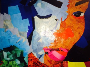
Title: “Selfie”
Medium: Magazine Paper, Bristol board, Scissors, Rubber Cement
Dimensions: 14×17
The elements of designs that I used were color, shape, and somewhat of a value change between the different types of orange. I used the triadic color scheme. My main colors were orange, blue and green. The principal of organization that I used was rhythm and movement, and emphasis. I love how I got the chance to incorporate a few colors that I like in order to show my personality, and style. I believe the focal point of my picture is the red nose. Its stands out, out of the whole face. I also added eyelashes to somewhat make the picture look and feel alive.
The strongest aspect of design is the lips. It actually looks like the mouth part of the original picture. I believe that the color in the hair should have been repeated. I actually ran out of the blue, so I tried to find others things that would help represent my “hair”. The weakest part of the picture is the neck part. I feel that I added too much texture and that it kind of threw off the picture. I wished I would have used more unity to draw my picture together. There’s a sense of harmony, but a little more could have been done.
My picture gives of a chaotic feel. That’s what I kind of like about it. You can’t really explain my picture. It takes your eyes on a sort of journey that the person looking at it may try to figure out. I like the fact that I stopped worrying about making my artwork look like its original drawing. When you’re busy worrying about originality, it gets in the way and makes it harder for the artist to recreate the work.
Project 6- Colleague Critique.
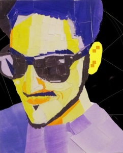
Paulo created a work of art influenced by the color scheme that he chose. He predominately used the different shades and tints of the color he chose in order to give off the different effects that his original picture depicts. I love how Paulo grasped the concept of this project. I can actually tell that he recreated himself. In fact it actually does look like him. He used paints unlike some of us who used magazine paper. I love how he lightened the glasses part to show that light was bouncing off his face. The background of the picture makes the picture pop. It kind of gave it a 3-d effect to it. His picture was done on 14 x 17 inch paper which I believe made it a little harder for him in order to position the papers in the right place.
The degree of representation that he used was to actually represent himself. His job was to basically recreate himself using by choosing a color scheme from the color wheel. The elements of design that he used were color, value, shape, and balance. He combined all of these elements in order to create his “selfie”. He created balance, movement, and a sense of proportion. I say proportion/balance because by looking at the picture I feel like I can split it right down the middle from the top of his hair down to his chin; and even with it cut in half the picture would still give off the same effect. That’s how powerful it is. Paulo’s work is very harmonic. The colors he chose somehow blended together well. The yellow that he used makes the picture seem energetic. For me the focal point is the upside down triangle the he uses to represent the hair under his chin. It’s the only triangle that I can spot in the entire picture.
Paulo achieved the characteristics of composition. The way he created emphasis, scale and proportion, and space makes the picture exciting to look at for me. In order to strengthen the picture, I don’t think anything should be changed. I believe its fine just the way it is. The strongest part of his work of art is his beard. The color of his bread helps to separate his face from his neck. Also the color that he chose was one of the darkest points in the picture and it really grabbed my attention. Although we couldn’t use black, he went on to find a really dark color to help bring out his features.
